Tutorials
How To Create A Landing Page With Bootstrap 4's Image Carousel
by Rubie Tiburcio
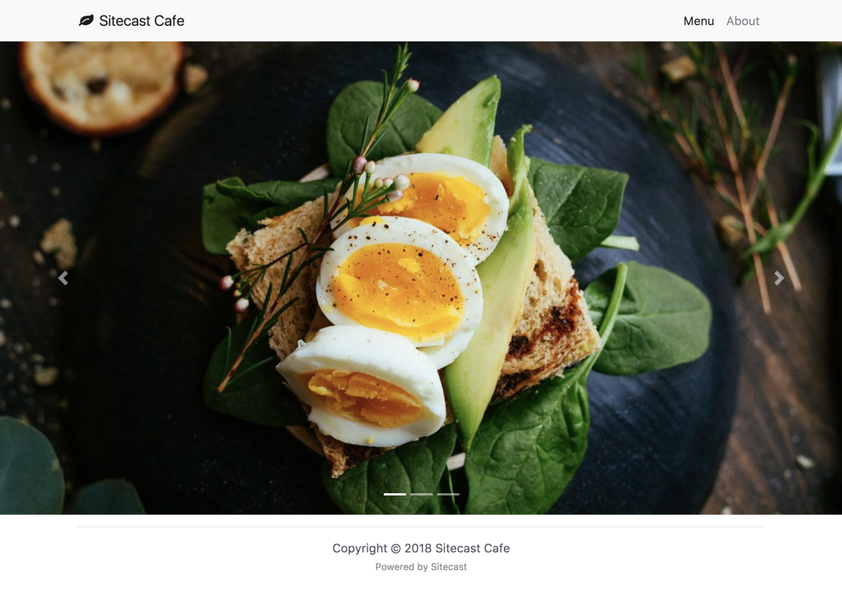
In this tutorial, we will demonstrate how to rapidly integrate with Cloudinary and leverage Bootstrap 4's Image Carousel to display a series of images.

Cloudinary
Create an account with Cloudinary to manage your media. You will need to have the cloud name, API Key, and API Secret Key handy.
In the Sitecast Editor, integrate the site's Cloudinary account by navigating to Your Site -> Add Ons -> Multimedia -> Cloudinary. Fill out all the required fields. This will automatically connect the account which will enable you to manage your media through the multimedia library.
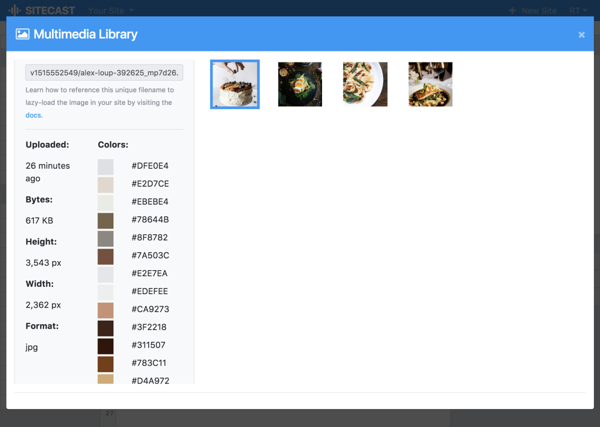
After setting the credentials, go back to the editor and head to the Multimedia Library toolbar. Upload all the pictures you will be using in this project. We also provide helpful information about the image to help accelerate the development.

By integrating your Cloudinary account, it'll automatically configure the Content Hub for uploading your images.
Bootstrap 4's Image Carousel
Bootstrap has a few carousel layouts you can choose from. Feel free to use any and follow the lazy loading guideline to add the images.
How To Load Images From Multimedia Library (Static Content)
<div id="carouselExampleIndicators" class="carousel slide" data-ride="carousel">
  <ol class="carousel-indicators">
    <li data-target="#carouselExampleIndicators" data-slide-to="0" class="active"></li>
    <li data-target="#carouselExampleIndicators" data-slide-to="1"></li>
    <li data-target="#carouselExampleIndicators" data-slide-to="2"></li>
  </ol>
  <div class="carousel-inner">
    <div class="carousel-item active">
      <img class="d-block w-100 cloudinaryDynamicImage" src="/blank.png" data-src="..." data-width="1600" data-height="900" data-html-width="100%" data-html-height="auto" data-crop="fill">
    </div>
    <div class="carousel-item">
      <img class="d-block w-100 cloudinaryDynamicImage" src="/blank.png" data-src="..." data-width="1600" data-height="900" data-html-width="100%" data-html-height="auto" data-crop="fill">
    </div>
    <div class="carousel-item">
      <img class="d-block w-100 cloudinaryDynamicImage" src="/blank.png" data-src="..." data-width="1600" data-height="900" data-html-width="100%" data-html-height="auto" data-crop="fill">
    </div>
  </div>
  <a class="carousel-control-prev" href="#carouselExampleIndicators" role="button" data-slide="prev">
    <span class="carousel-control-prev-icon" aria-hidden="true"></span>
    <span class="sr-only">Previous</span>
  </a>
  <a class="carousel-control-next" href="#carouselExampleIndicators" role="button" data-slide="next">
    <span class="carousel-control-next-icon" aria-hidden="true"></span>
    <span class="sr-only">Next</span>
  </a>
</div>
How To Load Images From The Content Hub (Dynamic Content)
From a previous restaurant menu tutorial, we created an appetizer item type. With the item type created, you will be able to load all the images from each item using Liquid syntax.
<div id="carouselExampleIndicators" class="carousel slide" data-ride="carousel">
  <ol class="carousel-indicators">
    <li data-target="#carouselExampleIndicators" data-slide-to="0" class="active"></li>
    <li data-target="#carouselExampleIndicators" data-slide-to="1"></li>
    <li data-target="#carouselExampleIndicators" data-slide-to="2"></li>
  </ol>
  <div class="carousel-inner">
    <div class="carousel-item active">
      {% assign appetizers = item_types.appetizer.published_items %}
        {% for appetizer in appetizers %}
            <img class="d-block w-100 cloudinaryDynamicImage" src="/blank.png" data-src="{{appetizer.contents.photo[0].filename}}" data-width="1600" data-height="900" data-html-width="100%" data-html-height="auto" data-crop="fill">
        {% endfor %}
    </div>
  </div>
  <a class="carousel-control-prev" href="#carouselExampleIndicators" role="button" data-slide="prev">
    <span class="carousel-control-prev-icon" aria-hidden="true"></span>
    <span class="sr-only">Previous</span>
  </a>
  <a class="carousel-control-next" href="#carouselExampleIndicators" role="button" data-slide="next">
    <span class="carousel-control-next-icon" aria-hidden="true"></span>
    <span class="sr-only">Next</span>
  </a>
</div>
Your initial image carousel is now built. Make sure to check out the Cloudinary's Image Transformations API Documentation to improve the images on your websites or web apps.
The next step is to design the landing page layout, make it mobile optimized, and most importantly, add search-engine friendly content to boost your SEO post-production.
Good luck, Sitecaster!