Tutorials
How To Create Responsive Photo Gallery Using Bootstrap 4
by Rubie Tiburcio
Bootstrap 4 has done a lot of the heavy lifting for developers and provided interfaces to build responsive apps. With all the new tags in the latest version, it reduces the complexity of making the viewport beautiful in all devices.
Combined with Cloudinary's API to transform images and Sitecast Editor to quickly integrate and build static pages, displaying anything on any screen just got simpler.
Cloudinary Image Manager
Create an account with Cloudinary to manage your site's media. You will need to have the cloud name, API Key, and API Secret Key to auto-connect using Sitecast Editor.
In the Sitecast Editor, integrate your site's Cloudinary account by navigating to Your Site -> Add Ons -> Multimedia -> Cloudinary. Fill out all the required fields. This will automatically connect the account which will enable you to manage your media through the multimedia library.
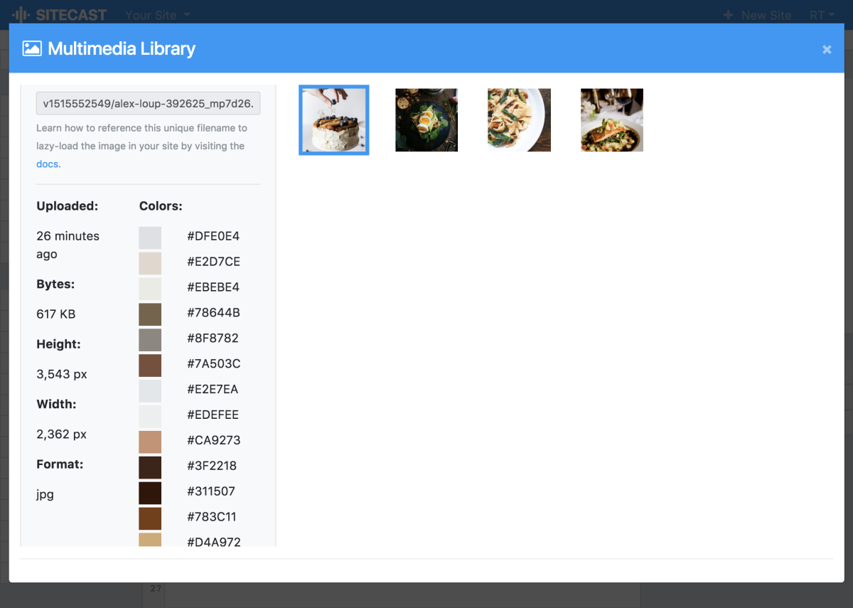
After setting the credentials, go back to the editor and head to the Multimedia Library toolbar. Upload all the pictures you will be using in this project. We also provided helpful information about the image to help accelerate the development.

By integrating your Cloudinary account, your Content Hub will be automatically configured to upload your images.
Create A New Screen
From the Sitecast Editor, create a new screen called menu_gallery. This will serve as the canvas for your page.
Create A New URL
Click the database button in the tool box, select and click Access Your Site's Hub. This will launch a new tab which is the content manager for the site.
Create a new account for your content storage. We recommend to use a different password than what you have used for your site editor. Go to the Resources tab and click New -> Blank Resource. Set the name the new URL to menu_gallery -- for both title and slug. Fill out all the fields for optimization. In the Show which Screen field, select the new screen we just created.

Create A New Block
Create a new block and name it menu_gallery.
Using Bootstrap, use the grid system to set the desired layout for your gallery for any device or viewport. In this tutorial, I will display three pictures across for medium (and larger) devices and single column gallery for smaller devices.
<div class="container">
  <div class="row">
    <div class="col-md-4">
      <img class="d-block w-100 cloudinaryDynamicImage rounded" src="/blank.png" data-src="..." data-width="1600" data-height="900" data-html-width="100%" data-html-height="auto" data-crop="fill">
        <p class="text-center"></p>
    </div>
    <div class="col-md-4">
      <img class="d-block w-100 cloudinaryDynamicImage rounded" src="/blank.png" data-src="..." data-width="1600" data-height="900" data-html-width="100%" data-html-height="auto" data-crop="fill">
      <p class="text-center"></p>
    </div>
    <div class="col-md-4">
       <img class="d-block w-100 cloudinaryDynamicImage rounded" src="/blank.png" data-src="..." data-width="1600" data-height="900" data-html-width="100%" data-html-height="auto" data-crop="fill">
      <p class="text-center"></p>
    </div>
  </div>
</div>
Attach the menu_gallery block to the menu_gallery screen using Liquid.
{{blocks.food_gallery.body}}

With the combinations of all these three tools; Bootstrap 4, Cloudinary, and Sitecast Editor, you should be able to take your image gallery design to the next level.
Have fun building!
Next Steps ...
- Optimize the code by utilizing the integrated Content Hub to manage and dynamically load the images.